VFX Style of Towerborne
Introduction
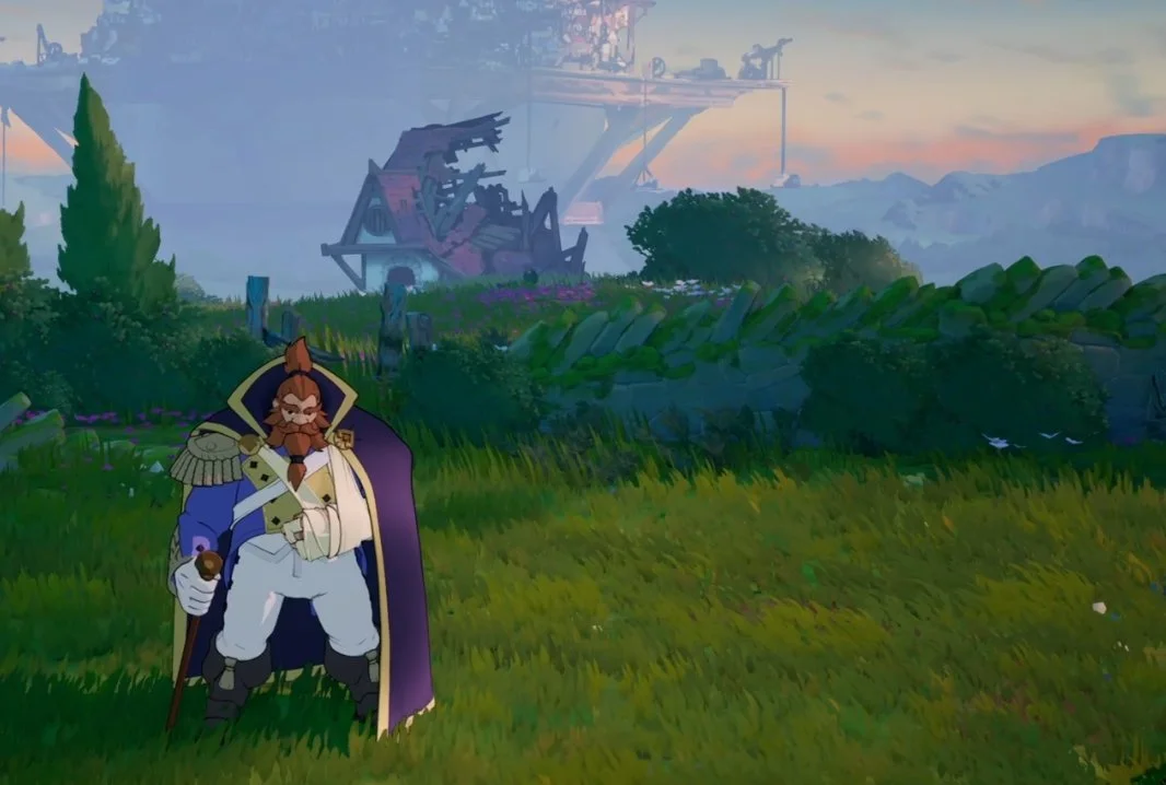
This article is an overview of the art and style of the VFX that were created for the video game Towerborne, developed by Stoic Studio, published by X-Box Studios. Towerborne is a stylized 3d, side scrolling, action RPG heavily inspired by the films of Studio Ghibli. The artistic aim of the project was to have painterly backgrounds with cel shaded characters doing all the action.
As the game developed figuring out what assets should be cel shaded and which assets should be painterly was very straight forward. If a player could interact with an asset, the asset would be cel shaded, if the player couldn’t interact with an asset, then it would be painted. For VFX, making a stylistic choice of cel shaded vs painterly was not so simple. Due to their abstract nature, VFX have a hard time conforming to standard rules. The same visual effect elements can exist in static backgrounds and player interactions all at the same time. Finding a space where VFX could fit that felt both painterly and cel shaded at the same time was the primary challenge we faced while developing the unique VFX style of Towerborne.
Style Development with the Lava Umbra
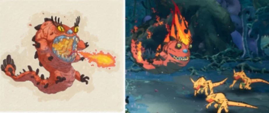
The first fully fleshed out version of the VFX style in Towerborne came in the form of a character referred to internally as just the "Lava Umbra". Thematically the character had the power of Lava. Each attack she possessed had lava as the main element type. This involved pools, splashes, and unifying color language to tie it all together.
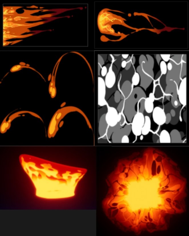
The basic idea was simple, use a primary and secondary color, focus on simplicity with as clean of a silhouette as possible. Stylized textures served as the base of each element. Procedural materials incorporated stylized masks all with the aim of creating channels for the primary and secondary colors. For elements that took up large areas of 3d space, simple geometrical shapes were used to fill the void. For Lava, the base colors would be saturated oranges and yellows, using high color value ranges to give the appearance of extreme heat.
The final effects blended extremely well with light and dark environments. Stylistically they fell in a sweet spot of feeling both tune shaded and grounded in a painterly background. Unfortunately the Lava Umbra was cut and very few of these effects saw a final release. However they pioneered how Towerborne VFX would be built for the remainder of the project. Every effect in the game has its roots in the Lava Umbra's pioneering art style.
Color Theory
Visual noise was a constant challenge for the project. With such colorful characters and backgrounds, we knew at some point the intensity of combat would turn the screen into a rainbow mess of VFX. To deal with the eventuality, we reserved certain color spaces for specific gameplay ideas, to ensure the player would have the information they needed to be successful. For example pure red was reserved for gameplay readability of enemy attacks. If a player saw red, they intuitively know danger. If a player saw green, they would intuitively see “health”. These reserved color spaces are key to communicating important information to players without a lot of visual noise.
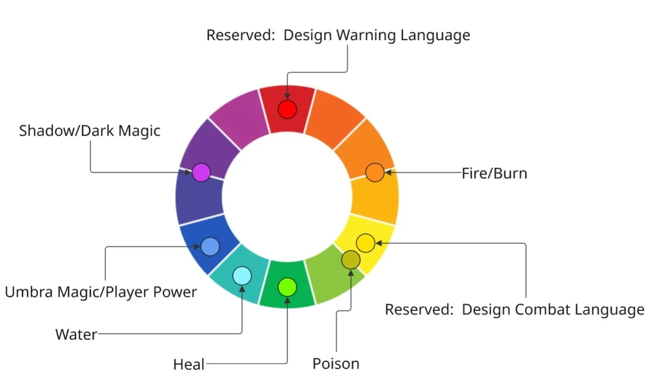
This color wheel example shows a simplified version of how certain color spaces were reserved for specific archetypes. This purpose driven approach to color space was crucial in achieving the final look of the game.
Color Theory Examples
Each specific weapon class had its own color space to help them feel different from other weapons. These color spaces were rarely shared with enemy color spaces. Sword and Shield for example, was set in the blue color space. Primary weapon trails had a slight blue tint to them. Special moves for each weapon class would build on established color principals by adding secondary color variation, saturation, and value. Heightened saturation and value were liberally used as punctuation on special moves or attacks that required high punctuation.
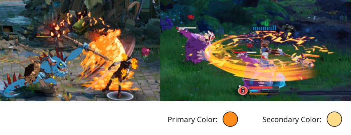
Some elemental archetypes had to be shared across enemy and player. Flame effects for example, follow the same color language regardless of if it is a player or an enemy. Making two different types of fire would create unnecessary noise and a lack of continuity. Stylistically certain elemental types had to have rules that were universal. Fire was orange, water was cyan, poison was green, ect. Ect.
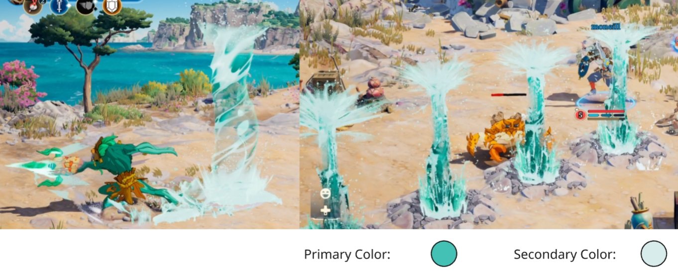
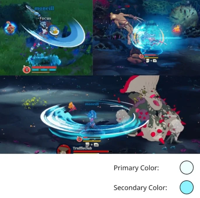
Similar to fire, water is another element that has to be universal not only to the players and enemies, but to the water seen in the environment. This posed a unique challenge due to much of Towerborne's color space being already blue. To give water its own space we opted to push a more cyan pallet with baby blue highlights.
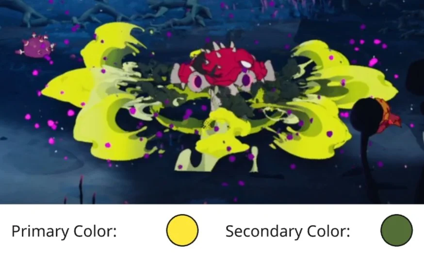
Another example of a universal archetype that was shared between players and enemies was poison. Pictured above, The Funguy's are a mushroom themed enemy in Towerborne. They are the main enemy that establishes the poison color language. We established the primary poison color to be a mix of green and yellow. This color space was reserved exclusively for anything that caused poison damage.
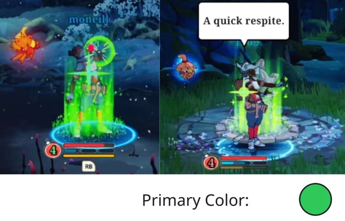
When considering the color green, it was important to reserve a very specific hue of green for pure gameplay language. Any gameplay effect that healed the player was reserved for the green color space. Healing was always a pure saturated green, unlike poison which was tinted yellow for better color separation.
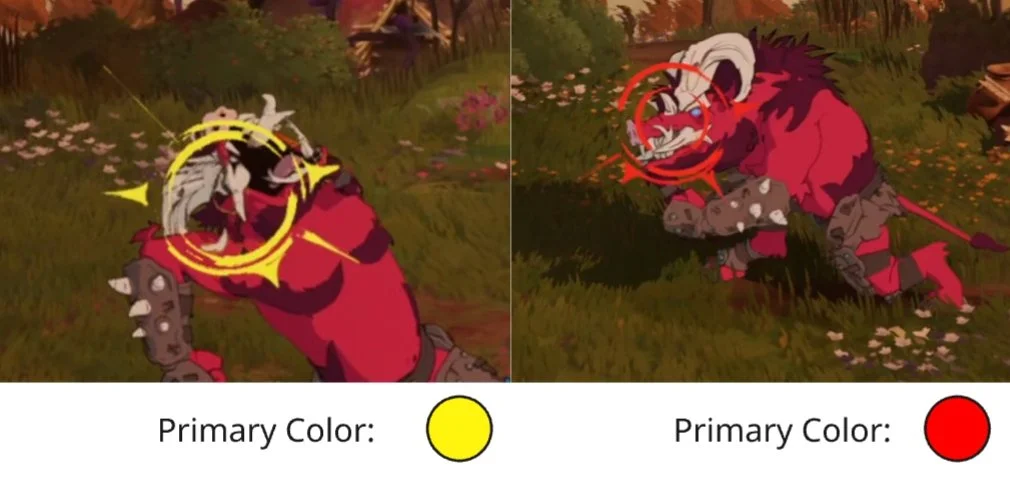
Like the healing effects, pure red and pure yellow occupied a very special place. They were restricted to specific critical information to the end user. In these two cases Yellow is used to call a user's attention to an attack that can be blocked. Red was used to tell players that an attack is unblockable.
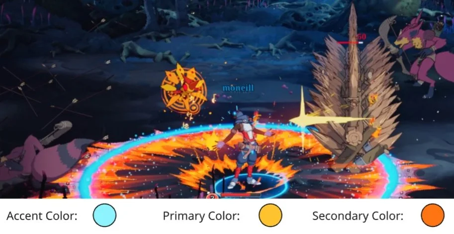
Certain Umbra abilities required extra color information to help them be readable from a user's point of view. In this example, an Umbra creates a flaming shock-wave causing burn to all enemies. In addition to the burn language that has already been established, we added blue accent colors to make it clear that this was a friendly shock-wave.
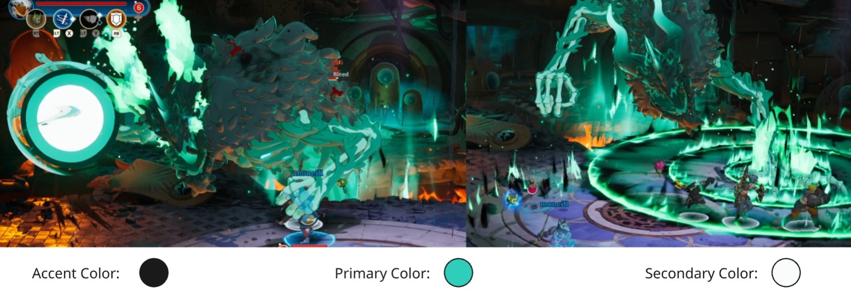
Graves, the final boss of Towerborne, had an interesting color palette; it started with an accent color of black and built up from there. We then layered in some blueish greens that gave Graves a particular evil feel.
Background vs Combat VFX
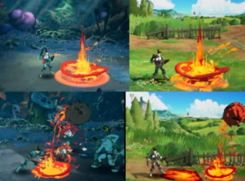
The last challenge we faced as part of the development of Towerborne's style was how do we make elements in the environment feel different than those in combat. Fire is a prime example of something that exists in both environment & combat, are the same element type, but needed to feel different.
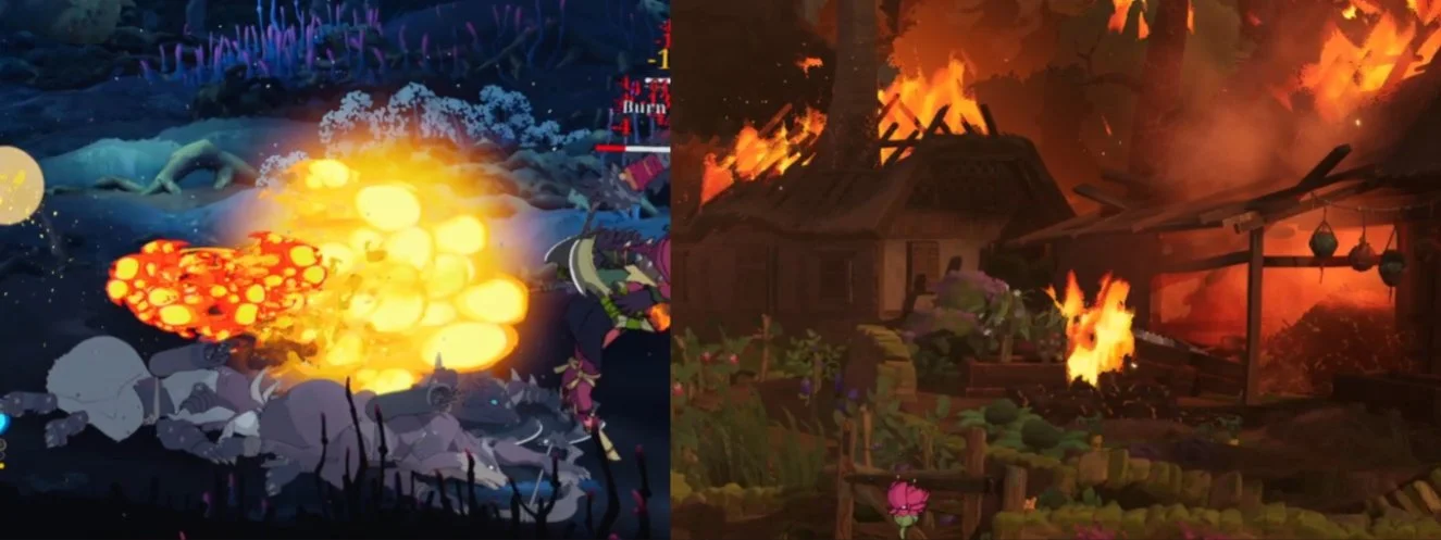
The stylistic choice we made was to give combat effects a clear distinction between primary and secondary colors. In the example above, you can see the combat fire on the left has hard edges and clear borders between primary and secondary colors. This compliments the tune shaded nature of our characters which also have hard borders between colors. Contrast that to the environment fire on the right where you can see gradients in value with softer blending between primary and secondary colors. This gave players a clear distinction between the two.
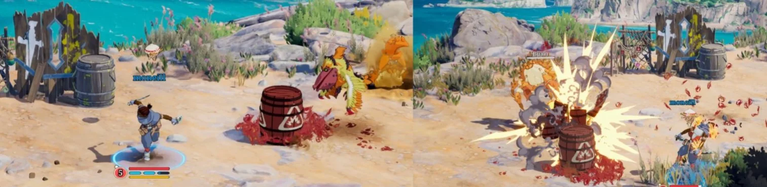
Another challenge we faced was the need to communicate to a player when an object has gameplay ramifications and when the same object is just a meaningless prop. We start by applying the same principal of the cel shaded vs painterly divide. If it can interact with a player in any way, harmful, passive, or helpful, it is going to be a cel shaded object. Anything else is just a background prop.
In the example above, you can see the contrast between a painted background prop and the red stylized exploding crab barrel (The design of the barrel was to have a horde of crabs lift up the barrel and try to guide it towards a player). The crab VFX are cel shaded and the explosion itself is crisp.
Conclusion
The VFX of Towerborne is something I am very proud of. They achieved a level of stylized fidelity never before seen in the genre. Every choice we made was purpose driven with an eye on clean design with the end user in mind. I hope by reading this you gained some insight into how the VFX style of Towerborne came to be.
Thank you for reading.